
My twitter Updates

The secret of London's 2012 logo
Thursday, June 07, 2007
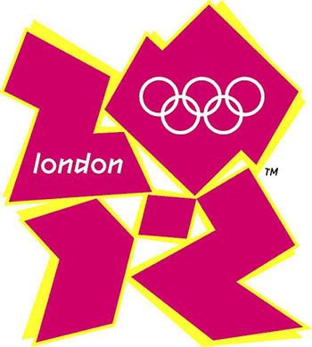
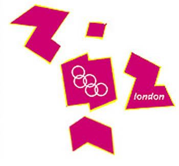
 It was designed to unite and inspire, but the newly unveiled logo for London's 2012 Olympic was condemn by the public.
The Games' organising committee insisted the £400,000 (AUD 959,000) invested in the logo - which comes in lurid shades of pink, blue, green and orange, and is meant to be a graffiti-style play on 2012 - had been money well spent but other people have said it resembles "a puerile mess", "toileting monkey" or a "broken swastika".
A day after launch, more controversy follows as an animated display of the logo was withdrawn from an official Web site following concern it could trigger epileptic seizures.
What a disaster for the London 2012 PR team! For me, I woudn't shoot it down so early. Those ppl who designed the logo are marketing genius'! There are so many other things that can be derived from the logo. Imagine the possibilities! You can make heaps on royalies by just patenting these babies! Don't get what I mean? Follow the instructions:
1. Cut out the logo. I've already got the template ready. So don't be shy!
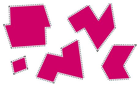
2. Here's the fun part, re-arrange the shapes into more recognisable objects. LET THE CREATIVE JUICE FLOW!
3. To start you off, here are some examples:

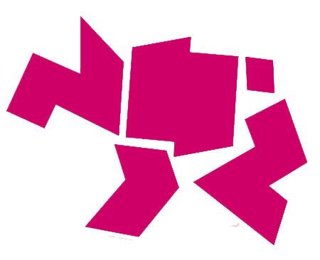
A dog and two ducks
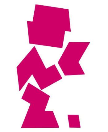
Triceratops
Man reading paper in the toilet
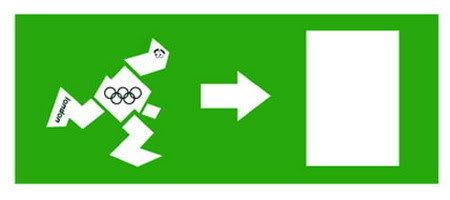
Heyy.. you can even make an exit sign!
4. If you're still having trouble, try finding a photo from a magazine or newspaper, for example:
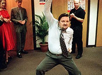
5. Picture it in your mind, move the shapes around (mann.. I feel like Derren) and with a little creativity;
:D Now you know! Have fun!
1 Comments:
Hahahahaha. Some people have soooo much time on their hands. I can so see u doing that dance *chuckles*
commented by  Mr DT, 6/08/2007 07:11:00 pm
Mr DT, 6/08/2007 07:11:00 pm